A path has been set to the re-imagining of what it means for humans to walk the digital landscape; to interact with a world once far removed, subsequently parallel to and now increasingly intertwined with what we know as reality.
Contemporary living shines light on the interesting dynamics at play in our complex relationship with technology; how it often complements and augments daily life to the extent that interacting with computers becomes synonymous with human-to-human interaction; this has led to the emergence of research fields including HCI (Human Computer Interaction), that are dedicated to the study and understanding of this relationship.
Ironically, computers whilst having been manifest from human ingenuity, reveal themselves nevertheless, to be rather complicated aliens whose manner of operation is often counter-intuitive to what we expect; their development over time it seems, drives them further and further away from our shared mental model of the world around us.
Not kept in check, this apparent disparity could eventually culminate in a complete divide of understanding between man and machine; somewhat reminiscent of a similar turn of events that is often played out in the vivid dreams of science fiction; Sketching the artificial intelligence of machines and our inability to understand them as bad news for the human race.
Thankfully, any imminence of an apocalypse brought on by the ever increasing capabilities of machines could for now, be mitigated by an equal increase in the level of sophistication of human-computer interfaces; perhaps well thought out UI’s have the potential to allow a better level of control over our expectations being met when interacting with computers of any kind.
A central role played by design thinking in human-machine relations has proven crucial in sowing closed whatever seams may part ways between user expectations and what they actually experience when visually interacting with the digital fabric of data.
An appetite for information
When observing our current affinity towards the usage of technology in our day to day affairs, it becomes apparent that UI (user interface) design has so far done a good job of bridging the communication gap between these data-crunching aliens and us, their hairy bi-pedal users.
Development over time it seems, has followed a path carved out in efforts to reduce the abstraction of the data universe into the more familiar elements of form, space and time. Elements that appear collectively as the Graphical User Interface (GUI).
GUIs have throughout the history of computers, featured in many different forms dictated by the technology limits of the time, however, with a new-found focus on user centric design, UX design and the study of HCI, intelligent systems and design considerations that are shaped more by user needs rather than technology capabilities have begun to take centre stage. This has enabled users to manipulate data at the fundamental level by interacting with shapes, colours and lines on a screen; the current milestone of UI design.
Fast forward to now and computers have gone mobile; we suddenly find our hands idle, wanting and without if a device isn’t sitting comfortably in them; we have grown so adept at using mobile technology in our daily lives that it has become a necessity. Parallel to this growth has been the extent of our appetite and length of our reach for information that we publish, consume and exchange on a regular basis. The volume at which this is taking place has brewed some varying levels of anxiety sprouting perhaps, from the sheer expenditure of our time that is often touted to be at the expense of ‘real life’ interactions; An ode to the dilemma of choice between our digital and ‘real’ selves.
It has therefore, never been more pertinent to design systems and interfaces that can keep up with, if not complement our increasingly busy, information permeated lives.
Time; a precious commodity
Users have grown short on time and attention, the result of data and stimuli prodding them from all directions. Various media take the lion’s share and other factors increment on this, which has made the limited time that users have in their pockets, a rather expensive commodity in the information market.
Inevitably tasks that render us torn with too many decisions to make, coupled with redundancies in the steps we must climb up in order to access what we want, result in a threshold that is perceived as too high to overcome. This is known in HCI circles as cognitive load. The more “cognitive barriers” there are to climb over, the heavier the cognitive load on the user.
A high cognitive load can result in the user abandoning the information channel they’re on, be it a website or app, and looking elsewhere for a lower cognitive barrier. Therefore, designing interfaces with an understanding of the relationship between these two psychological factors that greatly influence UX can allow us to get a foot ahead of the competition in a bid for user attention.
But how does one craft a wholly intuitive experience when designing a UI?
Amongst other things, when observing the behavioural pattern of users that are met with so called cognitive barriers, their tendency to seek out products or services that are easier to use could be understood as an instinctive or even emotional response to what is an otherwise mechanical process, by ‘easier’ we can assume the meaning to be less cognitive barriers to achieving the user’s intended goal along with creating a visceral path to reaching it.
Omotenashi and anticipatory design
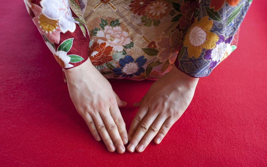
All this talk of emotion and intuition begs the question; shouldn’t we then be designing with a genuine humanistic approach to user needs? In the same way we would prepare our homes in response to the hosting of important guests? With that notion in mind, it becomes apparent that designing an experience with the same consideration that goes into handling human-to-human customer service relations i.e. convenience, ease of access and pre-emptive catering for a user’s needs, we can elicit a positive emotional response from users of our products and services.
This acute awareness, anticipation and thus sublime catering to, of customer needs is known in Japanese as Omotenashi お持て成し.
In this week’s post we will probe how Japanese design employs socio-cultural values in the crafting of their products and services to achieve brand loyalty and returning users both on and offline. Most interestingly, looking at how this translates on the web can offer some insights into the culture around Omotenashi in Japan; how social and psychological considerations that go into an amazing customer service can be applied to designing a sophisticated user experience.
The subtleties of the design language as a visual translation of Japanese cultural nuances displayed in the fishing company Kinoya’s website www.kinoya.co.jp shall be the vehicle through which we try to garner some lessons from the Japanese culture of hospitality.
Meandering through The Kinoya website reveals that the company is one that like many, goes to various lengths to establish residence in the hearts of its customers as trustworthy, quality-first and of having the warmth (and perhaps authenticity) of a human element at its foundations; values that the company deems important to its customer base.
A good look into some of the core values of Japanese society as it pertains to the consumer market in particular, reveals many similarities between the impression that one gets from Kinoya’s website and what their Japanese consumers’ expectations might actually be, in order to be sold on that impression.
The people-first mindset
One of the many fascinating aspects of Japanese society is the widespread seemingly, “mutually understood” culture of “people first” at the centre of all product and service considerations, as a matter of fact, visitors to the country are often at awe when they witness the extent to which customers are treated with a remarkable level of reverence, yet the locals seem surprisingly oblivious to this, and seem to think only of it as the norm.
There is an obvious appreciation for and awareness of user needs present when observing the lengths to which most products and services go to instil in their user base, unwavering trust and loyalty; why is that? And what user/customer experience lessons can be gleaned from this practice when it comes to the products and services we build online?
In order to gain an understanding of what Omotenashi entails and how it is applied in the use of everyday products and services, it is important to observe what it is that the Japanese consumer considers a “good” experience and what sort of things are done to ensure that those expectations are met.
Looks: UI design and typography

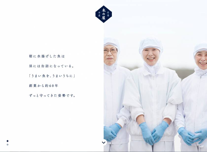
The site’s homepage initiates a clear, and unencumbered visual conversation with the eye through the modest use of colour, relying instead on an abundance of white space within which only the subtle hues of the almost ‘quiet’ imagery takes residence.
The visual arrangement on the home page immediately appeals to the visceral senses with tranquillity and an almost clinical cleanliness, impressions of note perhaps, in the business of fresh foods. Anyone who purchases food in Japan encounters the country’s love for good food, testament to the sheer care and consideration that goes into selling fresh foods which in turn inspires the great reputation that Japanese food enjoys for its overall quality and health benefits.
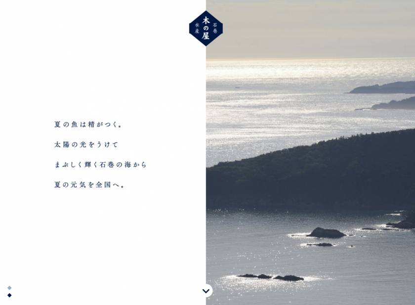
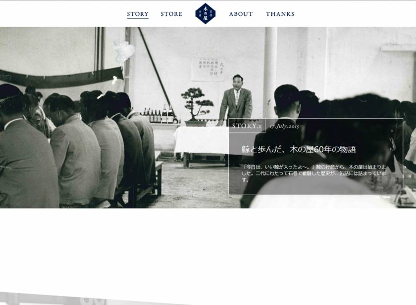
The site loads with the company’s logo first on stage, followed by a dual screen; text on the left and imagery on the right; Plentiful use of space or “ma間, (a recurring theme in Japanese design) on the left, houses the neatly placed, unassuming text alongside images portraying the modesty of the fishing village and that of its people on the opposite side. This arrangement allows the individual parts of the layout to have a clear, hierarchical relationship i.e. text supported by imagery.
The layout mechanics are simple and effective in conveying the company’s values of people rather than industry, being at the centre of a product’s inception and a sustainable production environment as a foundation. Placed with both apexes of the hexagonal shape in line with the border upon which the two faces of its brand meet, the Kinoya logo binds the parts of the company’s brand identity together in balanced harmony.
This a well thought out layout that aims to convey the company’s bi-pedal brand; that of an environment-conscious fishing company that retains the “personal touch” in a business run by global markets and industry that are often perceived as concerned more with profitability than quality.
Under the hood: Usability
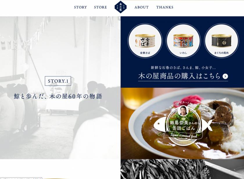
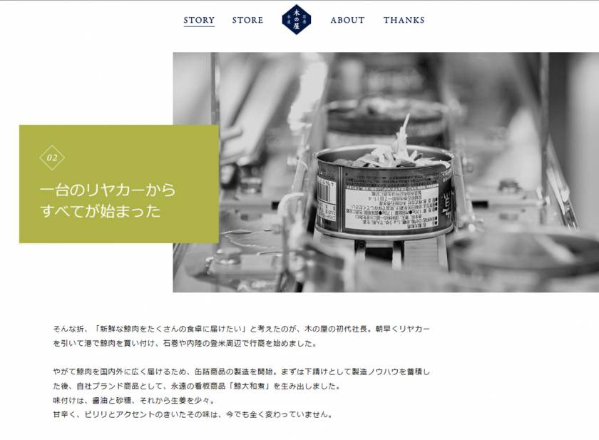
The layout of the website changes below the fold from the two-sided layout, to a grid containing blocks or what can be seen as “portals” into the various stories of the company. It is also at this level of the layout that the company allows the user to get acquainted with the “faces behind brand”; consistent with the people-centric brand identity.
This is a rather unusual direction the company has taken in going to great lengths to put the company’s social history with a personal anecdote about its community-based production process first before the actual products it makes shows that the company is not sales or market driven, but more user-centric and environment conscious.
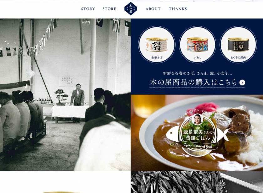
The Kinoya website displays genuine empathy by acknowledging and thus anticipating that in the foods consumer market, within the fishing industry in particular, there is great concern for the sustainability of the business and its negative effects on the environment.
Rather than addressing those issues with a statistical parade or taking “a numbers approach”, the website has been carefully arranged in the form of a narrative grid that tells the story of a company with humble beginnings and a reputable time in the fishing business side by side with the resulting quality product from that dedication to quality.
This layout elicits brand trust from the user by appealing to their probable impulse to know the story behind the product against the backdrop of moral values and to understand the process behind the food on their table.
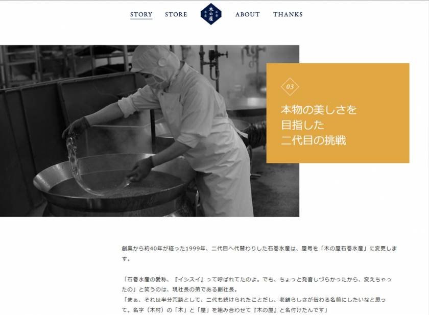
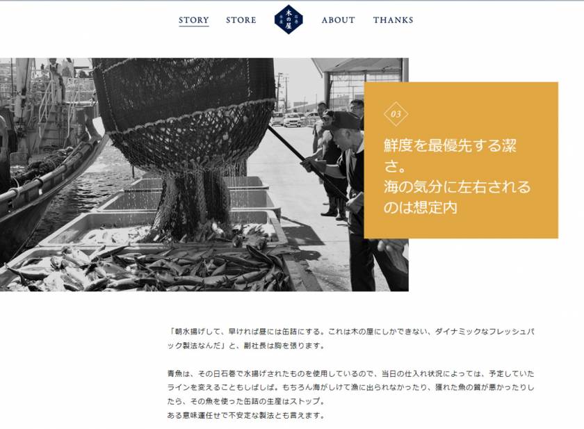
Kinoya’s story is supplemented by a well organised exhibition of their production process, from the fishing village to packaging and distribution of the products, with a focus on quality achieved through capable human hands as opposed to an assembly line (whether one is in actual fact used or not) or industrial machinery.
The significance of this scrolling photographic exhibition in terms of usability, is how it creates a sense of one traversing a chronological timeline of origin, as if meandering through the different parts of the fishing villages at which these processes most likely have their beginnings through a sideways fly-in fade technique that reveals more content on the canvas as the user scrolls.
The fly-in fade method with different steps in the process denoted by a colour coded, left-to-right variable layout that uses black & white imagery accompanied by text blocks or “tags”, allows the user to connect with the visual account of the people, place and process from which the product is conceived.
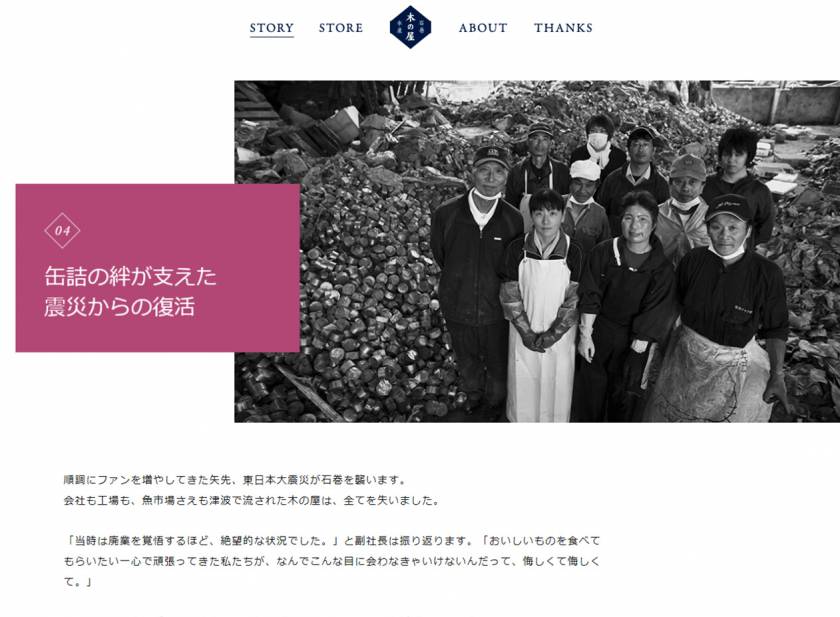
The resulting effect is a subtle courting of the user’s trust in the brand’s promise of quality and that of consistently walking a pristine path when it comes to sustainability and environmental responsibility; a clever soft-sell that glistens with an air of unassuming modesty and an almost religious dedication to the perfection of a single craft; both virtues carried deemed of high regard within Japanese society.
The Kinoya website’s focus on putting the spirit of community and people-empowerment above all else, goes a long way in laying the credibility foundation from which the company’s product can be perceived by its customers.
The carefully selected images of the fisheries and the people that work at them, opens an empathetic window of transparency to the end-user who may well end up buying the product with the predisposition that doing it will keep these fishing communities, most of which are generations-old family occupations (as is often the case in Japan) in business, ensuring thus, the maintenance of the promise of quality.
Something about it: Design innovation
The design innovations on the Kinoya website traverse a broad range of user-centric considerations; from the subtle efforts towards quality assurance without excessive focus on the end product, the narrative journey into the company’s tree of life and the well-constructed layout that doesn’t put the product before the consumer choosing instead to take the empathetic path relying on a meaningful connection being formed with their customers to encourage both intrinsic and extrinsic brand loyalty; which on the web, translates to returning users.
This is the Japanese spirit of Omotenashi; truly understanding the customers, anticipating their needs and finally, subtly but effectively going the extra mile in addressing those needs without getting in the way of their primary objective. (Getting them to keep coming back for the tin fish in this case)
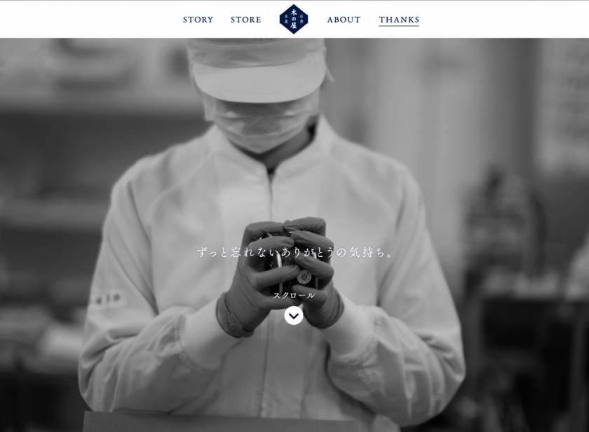
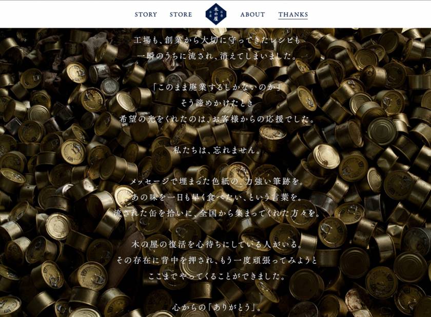
One innovative addition on the site stands out as a nice touch; i.e. the “Thanks” navigation item and dedicated page.
Few websites/UIs go to such lengths as to include a thank you page expressing gratitude to the user/customer for their time and interest in the product. Although seemingly unnecessary and perhaps a little counter-intuitive at first, it relates to a greater notion of acknowledging the fact that people are the centre of any good product or UI we design.
The simple presence of the word “Thanks” as one of the navigation items on the website drives home the idea that Kinoya is all about people and the many hands that help put the company where it is.
There are a few lessons to be learned here about empathy for the user not just at a surface level but in a deep and meaningful way. Good UX design is as much about being human, and designing as a human being with an awareness of what providing a good experience means as it is about the technology or data available to us that can anticipates user needs.
Regarding our users as important guests goes a long way in ensuring solid brand trust and returning users, which is what everyone wants anyway, but more importantly wearing the empathic hat when designing anything, because it is after all, peoplethat use these things we make.
Read more about Laura Busche’s anticipatory design and cognitive considerations in UX design:
http://www.smashingmagazine.com/2015/09/anticipatory-design/
https://uxmag.com/articles/cognition-the-intrinsic-user-experience