The Japanese mental model
Information Architecture, or IA is undoubtedly one of the most important foundations of a good user experience; going beyond the aesthetic horizon to communicate, IA seeks to be a digital explorer’s trusted guide through the electronic multiverse of information.
Often presiding beneath the shiny shell of a website or application’s visuals, IA dons a somewhat less glamorous reputation than that of the former. This may just be due to our default subjective setting when dealing with what’s in front of our eyes; users are often taken (at least initially) by the way something looks rather than how it works.
This makes things interesting when looking at design in the online world where IA is ubiquitous albeit invisible and arguably just as significant as the existence of the World Wide Web itself. Enter search engines; an eventuality perhaps, of the overwhelming need to make sense of the vastness of information online. Indexing the web using an IA based on tiers of relevancy and popularity amongst many others, search engines like Google have effectively become a universal map for travelling the web.
Carried on the fringes of our ever evolving shared world view, IA is built over the precipitation of that general understanding of the world into a contextual and often personalised knowledge of how something works or is ‘supposed to work’ i.e. our mental model. User interfaces often use the intended user group’s mental model as a foundation for how it looks and works, consider online shopping and its use of concepts such as the ‘shopping cart’ and ‘checkout’ familiar to anyone who has used wholesale retail stores.
With this in mind, it gets interesting to observe how different societies and cultures’ mental models over and above whatever may be considered the ‘global world view’ influence the organisation of information and eventually the function and design of those digital products and services including language usage, iconography and browsing flow, possibly providing a window into the mind of that society and its users.
In this week’s post, we’ll be looking at the innovative use of IA techniques combined with stunning visuals in Japanese websites to provide a good user experience, including what role some elements of Japanese culture and society have played in designing with that mental model in mind.
The challenge in designing a good IA lies in understanding a user group’s mental model and designing a user interface that matches it to the closest possible degree, the same way online shopping has done. This can rely on pre-existing notions or carve out a new model by using consistent language and rules that over time grow to be ‘universally understood’ and accepted as the norm, either way, familiarity with the user group’s culture and social behaviour is important.
The same is true of Japanese society; The Japanese mental model as demonstrated by the myriad differences compared to ‘western’ culture could very well be another world entirely and although some similarities can of course be expected, the differences may require more attention.
Understanding how users make choices when interacting with an interface and how to properly communicate what those choices entail, demands some familiarity with user social intricacies including consumer behaviour, language and priorities when navigating a UI.
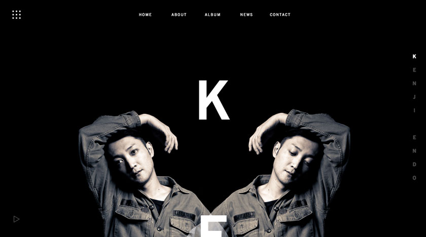
If we consider the navigation of a UI as the ‘front door’ into the various chambers of an IA house, it becomes pertinent to focus the analysis of its [navigation] creative use in combination with visual design from there; along this thread, the ‘house’ we will be inspecting is that of the Japanese musician Kenji Endo (www.kenjiendo.com) whose website is a showcase of the artist’s personality and music (perhaps as influenced by each other). This will play out as an audio/visual journey through the artist’s personality and music, a journey throughout which the significance of good information design quickly becomes apparent.
Navigation is only a means to an end
The importance of an efficient navigation system when it comes to UI design cannot be overstated. The organisation of information presented to a user can have a direct influence on the overall user experience and determine whether the user will return or not. Consequently, the more information there is to show the more imperative IA becomes to ensure all of it can be reached in an efficient and non-obtrusive manner.
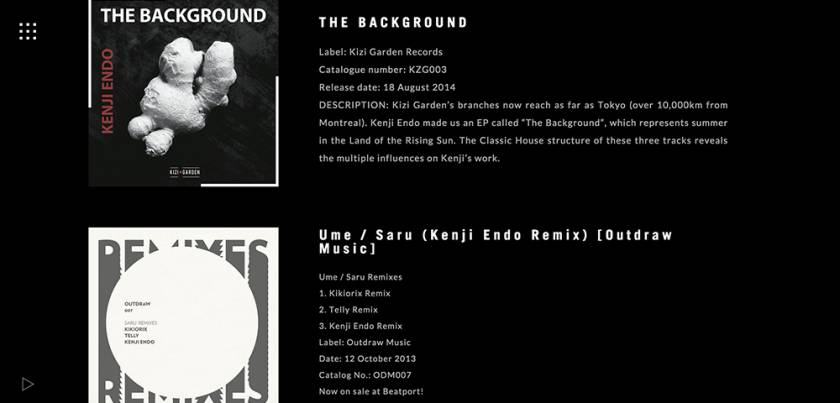
This confirms the position that information architecture and the resulting design of a UI’s navigational structure although deserving of attention is not the main star of the show, that role belongs to content; Navigation is only a means to an end, that end being to reach content and ultimately prompt user action, whether it be clicking on a “buy” button or walking away with information that may eventually turn into physical action such as attending one of Kenji Endo’s live performances or purchasing one of his albums.
Looks: UI design and typography
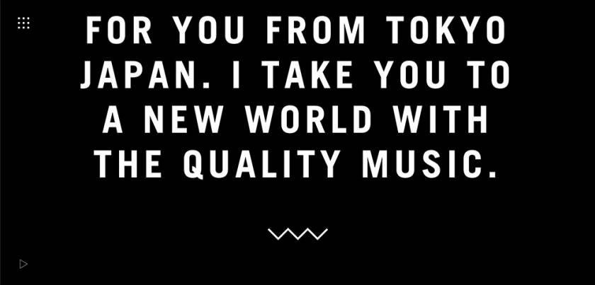
On loading the site establishes a browsing experience set against a backdrop of Endo’s soundtrack. The music fits well the aesthetic environment; Composed on a dark space contrasted with brighter design elements and typography including the use of abstract line, shape and high-contrast photography all of which sparsely populate the seeming void wholly occupied only by music in the background.
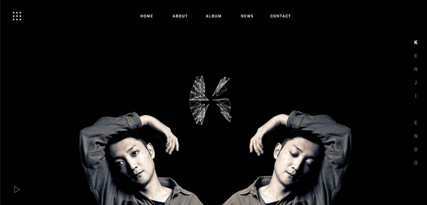
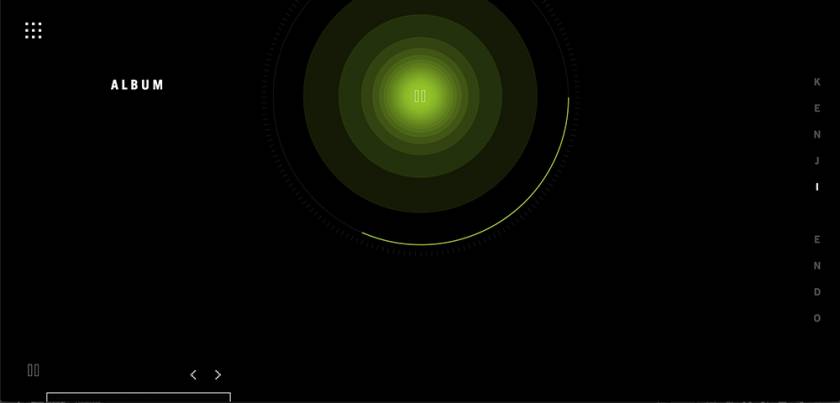
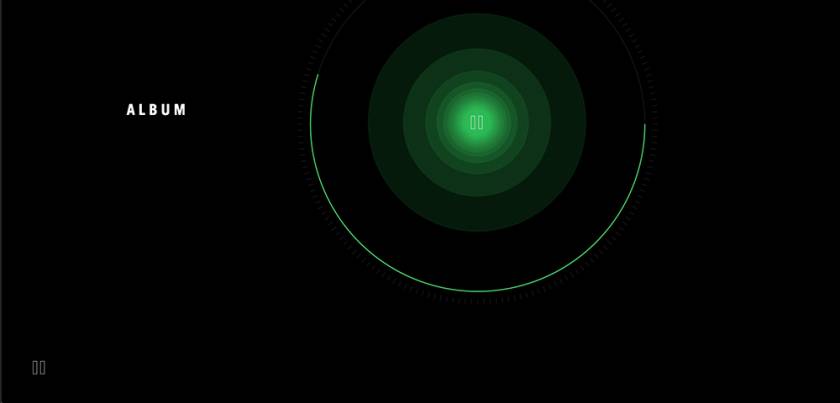
The UI forms a visual relationship with the soundtrack using an OpenGL graphic visualizer that turns each wave of the electronic synth into visual elements of design including line, shape and colour, resembling a digital music player with a seeker showing the progression of the track; This further strengthens the user’s experience of an integrated audio/visual browsing journey, effectively creating a visual narrative of the artist and his music.
The story-like presentation of content using the html5 canvas’s parallax scrolling technique although not unique to Japanese web design, is a recent design innovation whose function (if properly employed) would be one of the ways in which browsing as it pertains to navigation through the UI has undergone a fundamental paradigm shift; browsing through the different sections of a website doesn’t have to be a fragmented experience with users feeling as though clicking on a link is a choice between giving up their previous disposition for new content, with the way back also appearing fundamentally disjointed.
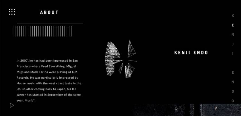
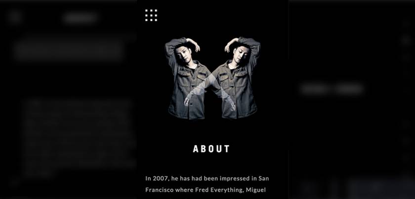
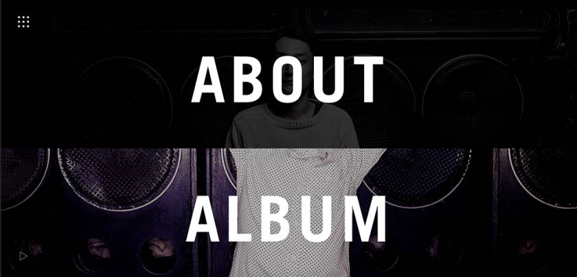
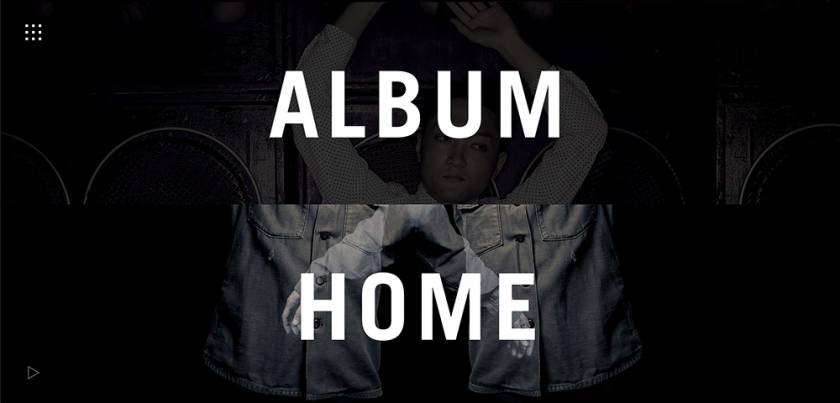
The site uses stunning high contrast photographs of the artist in his element to create the reflection of his personality in his music. Clicking through the rest of the site reveals different images of the artist assigned to each section as complementary visuals to what the section entails, somewhat setting the mood and scene for the content to follow.
The dark background setting with large and irregular spaces between the visual elements affords the user a sense of temporary suspension in a timeless void, seemingly floating on the waves of music until from time to time the user’s eye meets with content; This sense of journeying through digital space is further accentuated by the page’s “reactions” or various hover-over feedback mechanisms over the page elements.
Under the hood: Usability
Although there are many sites that have employed the parallax technique to turn their websites into content narratives, not all manage to challenge the inaccurate notion that content consumption is a linear process and the way to get there is by only clicking through the site’s pages in a linear or ‘top-down’ fashion.
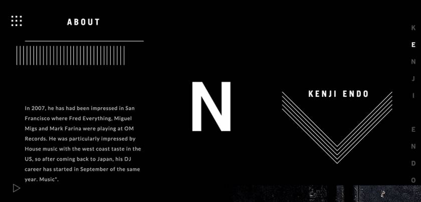
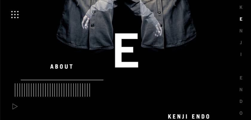
Kenji Endo’s website separates the different sections of his website into clickable blocks as though they were different aspects of his persona; having written the letters of his name vertically, characteristic of the unique case of Japanese text that allows designers the choice of either vertical or horizontal display, each letter becomes an indexing point for the user’s scrolling journey through the artist’s personality and story.
“romaji” or roman characters have been used as the typography of choice and one notices that the visual harmony of the composition would be just as balanced if Kanji and Hiragana characters were to be used instead.
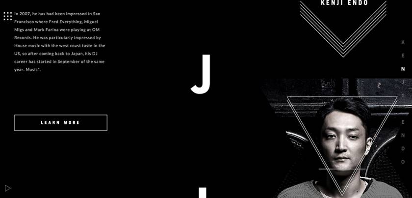
It is worth mentioning that although the website’s index page when viewed at desktop level, has the standard display of hyperlinks at the top of the page from which the trip through the site can be embarked on, special attention seems to have been given to availing various branches of navigation into the site, all of which use the same IA tree.
These include, scrolling downwards and clicking on any of the visual elements including a photograph of Endo or clicking the menu launcher designed using stunning iconography organised in a neat grid, giving the site an app-like UI edge.
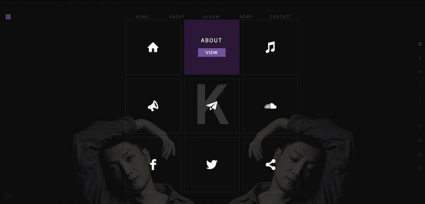
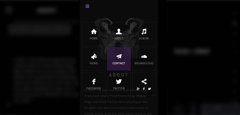
The constant visibility of the menu launcher becomes instrumental in retaining the same ease of navigation when the site’s dimensions cross the mobile viewport threshold allowing the design to maintain much of its original form at various screen sizes; when considering that one of the outstanding purposes of a good IA is to create a navigation system that ‘guides’ the user through content and thus reduces the number of choices he has to make, it quickly becomes noticeable the role that visual and structural consistency plays in ensuring a good user experience.
This becomes especially important when a large amount of information is displayed such as a list of blog posts or Endo’s album catalogue.
Further than reducing the number of choices a user has to make, a navigation system has to make provision for an easy way to ‘get back’ when going through the site. A content tree that can be traversed back and forth with the same level of ease is the outcome of a good IA design.
Endo’s site does this very well using the aforementioned various navigation forms that are well integrated to provide a harmonious system, the most significant in this sense being the accordion-style ‘blocks’ or sections of the site that constantly trail behind the focus content; they resemble the collapse and expansion of an accordion, allowing the user branches further within the content and a branch back to the top most level.
This ensures the user never feels lost and creates the impression of a limited space that the user will easily get familiar with after browsing the complete navigational tree.
The level of user reassurance provided by all these mechanisms including the variety of navigational forms may be the result of the Japanese mental model of the desire for surety and definition when dealing with new things, the same mental model can be witnessed in various forms of Japanese media that satisfy the Japanese consumer’s demand for details in the introduction of any new product or service that if lacking in information is often considered untrustworthy or of a low quality.
Something about it: Design innovation
The small design innovation on Kenji Endo’s site takes the form of many things including the creative use of photography, light, sound and space. As mentioned previously, the arrangement of all these design elements together with the selection of music successfully creates a browsing experience wrapped into a sublime audio visual package.
Outstanding, is the creative use of typography as not only text, but as a shape within space, a complementary visual component; One of the props upon which the composition holds together,in particular, the broken up letters of Kenji Endo’s name arranged vertically in the same way traditional Japanese writing would be, serve the role of something akin to milestones in the scrolling journey through Kenji Endo himself.
They are markers in the different points of his music and his personality, as if clicking each letter of his name on the right of the page and thus scrolling downwards is to slowly get acquainted with the artist and his art.
Read more about Japanese consumer behaviour here: http://adv.asahi.com/modules/english/index.php/content0006.html
http://asia.nikkei.com/Business/Consumers/Japanese-brands-are-reliable-not-so-cool