The striking difference in the design of Japanese websites compared to design trends prevalent in the west has been and still is a fascinating and curious landscape to the western eye, perhaps due to a similarly different and intriguing world of Japanese culture, language and society.
Culture, language and society are arguably most essential to the ubiquity and influence of design in every aspect of our lives, so much so that in fact design eventually becomes the mirror through which the intricacies of our social behaviour become apparent; the advertising industry for instance, thrives on constantly observing, understanding and using this information for monetary value.
Similarly, in web design understanding the user is of paramount importance and it’s from this that the concept of UX (User Experience) has emerged and stamped a paradigm shift on traditional buyer and seller relations in the digital space; providing an experience is now just as important as whatever goods or services are on offer. Visual design (UI), Information architecture (IA) and technology combined in creative ways ensures a good UX ensuring that the user will return which is the whole point to the business, returning users.
In this series of posts, we’ll be looking at the web design landscape in Japan, and how the country’s cultural context has carved out an industry that is generally considered at odds with what is accepted as the standard with regards to using the latest design trends and web technologies, all with the intention of providing a good UX for the user, a “western user” within a western context.
If Japanese web design can perhaps be (at least at surface level) considered a reflection of the inner workings of Japanese society and more specifically the Japanese consumer, the resulting UX from a Japanese website or application would likely not quite be what is expected in any usability study conducted in the west; from the complex writing system of Hiragana, Katakana and Kanji, and exceedingly dominant mobile usage to the highly competitive consumer culture,the web in Japan has certainly evolved into a world of intrigue.
The design sphere in Japan, from digital to interior to architectural and various other disciplines is often seemingly layered with paradoxes: sublime minimalism often existing parallel to overwhelming clutter and chaos, the serenity of temples and shrines in the midst of a bustling metropolis and outdated web technologies such as flash and IE 6 still at large in a country that’s often at the precipice of technological innovation are but a few.
Some websites however, have transcended this juxtaposition and are neatly reshaping those paradoxes into what may be a new and interesting design language.
One such website is HereNow.City www.herenow.city a travel site providing information about the best spots to visit in the south pacific island’s cities. It’s a bilingual Japanese-English language website, I am reviewing the Japanese language version (find a language switcher in the footer of the site).
We look at what went into providing a good user experience through three windows: The UI; visual design and typographic considerations, usability pluses and minuses, and finally one design innovation.
Looks: UI design and typography
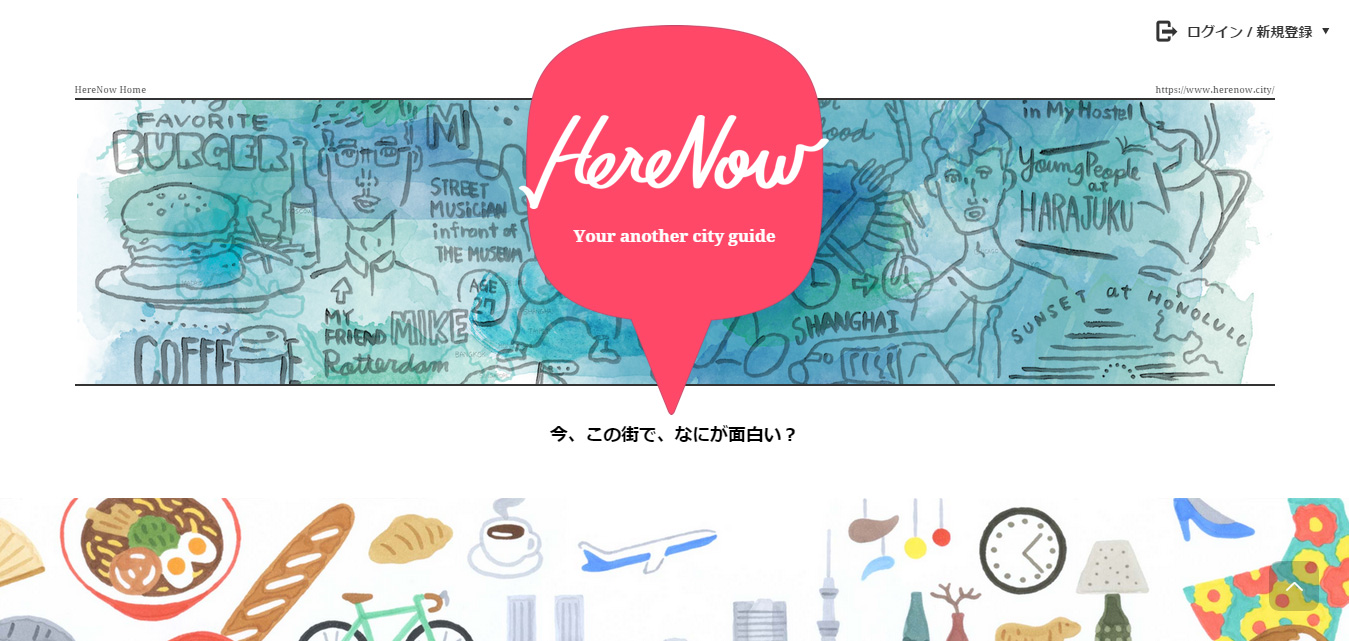
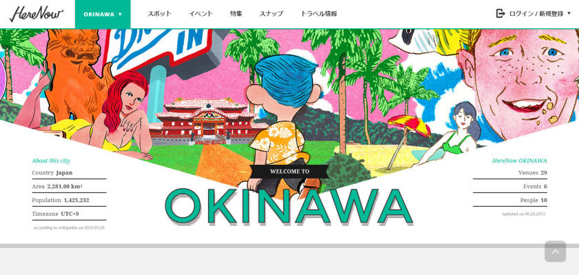
The site opens just below the branding with; 今、この街で、なにが面白い?“What’s interesting in the city now?” a promise of currency and relevance in the information to follow; the language used immediately establishes a casual relationship with the user, possibly targeting a young and adventurous user base.
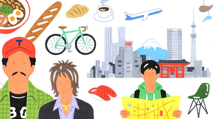
The site’s landing page is organized into horizontal sections ranked by popularity representing a city each. The visual cocktail of vibrant colours carried through by the quirky illustrations evoke a sense of fun and playfulness further drawing a contemporary travel portrait with each city section having its own theme of illustrations composed of elements that in combination represent the city’s visual atmosphere.
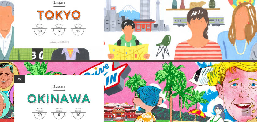
The pop-art style illustrations are overlaid by the city titles and three sets of statistics as a pretext to the information within; the number of venues on display, the number of events and a number of people (the purpose of which eludes me), nevertheless, the use of typographic hierarchy has chosen to follow western design standards with the use of “romaji” or the roman alphabet designed perhaps to complement the visual aesthetic of the accompanying illustrations.
This makes the clickable sections akin to travel advertisement billboards that tend to lean towards a slightly kitsch appearance but maintain a certain level of sophistication.
The nature of written Japanese affords Japanese designers the luxury of choice in the use of horizontally or vertically oriented text; the manner of reading from left to right in the west would render this a nonsensical design approach in most cases, in Japan however, although the two orientations each have their place (vertical for traditional, or Japanese subject matter and horizontal for contemporary texts) users can readily alternate between reading from left to right or right to left depending on the text orientation, making for an interesting case in typographic considerations when designing for the Japanese user.
Under the hood: Usability
The primary function of HereNow.city is to present a high-level categorization and recommendation of places in the city worth a visitor’s time, and therefore the daunting face of choice should be digested with good use of Information Architecture (IA) in such a way that the user can arrive at an informed decision in a quick and efficient manner, while also allowing room for serendipitous discovery without too much funneling; a challenging feat seldom met with 100% successful results.
Nevertheless the site strives for a fun but informative meander through the presented data.
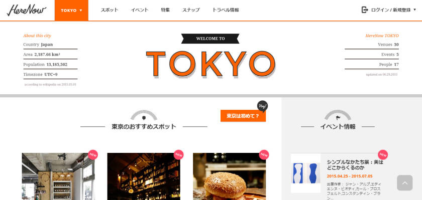
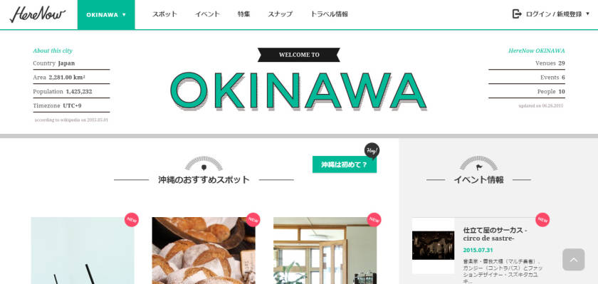
Delving into one of the city tabs reveals a themed world of information with the colourful illustrations having gently receded to be replaced by a careful negotiation of space using typography and imagery, a small testament to the remarkable control with which the Japanese can make use of space; evident that it is not wasted while simultaneously making provision for the occasional pause, or “breathing space” between the consumption of information on the page, just as in daily Japanese communication, allowing those brief pauses in speech to make room for contemplation is common practice; this is the Japanese Ma 間.
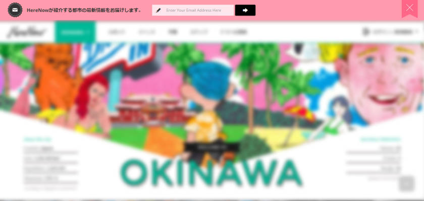
Landing on the page one notices a soft pink bar at the top of the page making an entrance with an equally soft CSS3 animation, its appearance is all but obtrusive, slightly at odds with the consistent theme of the rest of the page but not to a level that renders it at loggerheads with the visual harmony of the bright hues throughout the site; it is none other than the usual “subscribe to our mailer” prompt we’ve all become so accustomed to seeing, often clicking “close” without even blinking.
The placement of this “pop-up”does not appear as a modal window as is often the case with many sites, thus interrupting the user’s browsing experience. It is instead gently introduced at the very top of the page in a non- obtrusive manner and should the user decide to opt in for a subscription they need only enter an email address making the process seem easy on time, something which matters a lot and is often in short supply when it comes to users of the web.
This is a subtle employment of PET (Persuasion, Emotion and Trust) techniques of usability; techniques that if used correctly can help websites and applications elicit long term user action such as signing in or subscribing, essentially forming a business bond with the user which often will result in the return of that user to the website. The challenge of course is doing this without having a negative impact on the overall user experience.
Learn more about PET design here: www.humanfactors.com/training/pet.asp
The header section of each themed page is populated with a bold title donning the consistent colour accents over page elements such as buttons, hyperlinks and any other area on the page a user is meant to take special note of。
There is a lot of useful information across all corners of the site, from statistical information about Japan to the “Hey! 沖縄は初めて?(First time in Okinawa?), a result perhaps of designing for the Japanese consumer whose browsing experience generally isn’t perturbed by having to read and thus typically judges the credibility of a product or service upon how much detailed information is provided rather than a lack thereof.
This is generally not the case with western websites as dense text is usually seen as a hindrance rather than an aid to providing a good user experience.Japanese designers in this regard may often be faced with the challenge of striking a balance between these two paradigms when designing for both the domestic and international market as HereNow.city has done.
Perhaps this would explain why when browsing some bilingual sites in Japan, toggling the language instantly transports one to what seems like a completely different website.
Something about it: Design innovation
The design innovation in this particular case is content based and is not immediately noticeable, but I found that the site being a city guide seemed to double as something along the lines of a street fashion blog;
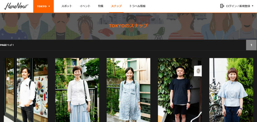
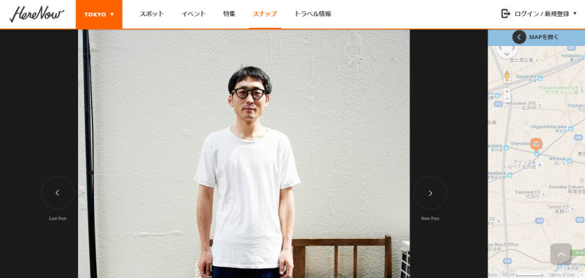
Clicking on the navigation item “スナップ”or “Snap” brings back a grid of photos taken of random people from the streets of the city the user happens to be browsing about. They appear as profiles that when clicked on display personal information about the people including a google maps API snapshot on the side to show where in the city the person’s photo was taken.
This I found goes a long way in bringing a sense of realism and personality to the browsing experience of the city’s attractions.A worthwhile addition on the site in evoking a sense of “actually being there”, walking the streets of that city and possibly walking past the very people shown in the photos who on the website become the humanistic representations of the city’s personality.
These are snapshots or “スナップ” of “real” people in a “real” city.
Somewhat far removed from the index page’s tourism commercial-like illustrations of the city’s features, this affords the site a good balance of quirk and relevancy, which makes for an overall great user experience.
Check out the site at www.herenow.city.