The new logo emblem for the Tokyo Olympics 2020 was unveiled last Friday 24th July 2015 at an official ceremony in front of the Tokyo Metropolitan Government office. In precisely 5 years to that day the Olympic and Paralympic Games will open: July 24, 2020.
![]()
The emblem, as well as the overall brand identity, was designed by Japanese designer Kenjiro Sano of MR_DESIGN Inc. His visual concept was picked from 104 logo entries through an open submission.
![]()
The emblem was designed using minimalist geometric shapes and represent the letter T for Tokyo, Tomorrow and Team. The Paralympic Games emblem incorporates a vertical equals sign (=) to represent equality.
“The black colour of the central column represents diversity, the combination of all colours. The shape of the circle represents an inclusive world in which everyone accepts each other. The red of the circle represents the power and strength of every beating heart.”
Added to both emblems is the lettering Tokyo 2020 which seem to use a customised version of Robert Besley’s Clarendon font (later polished by Edouard Hoffmann and Hermann Eidenbenz). Clarendon is a sturdy slab-serif font prominently used in many modern logos such as Sony, Wells Fargo bank or Starbucks menu lettering. However Clarendon is also a 19th century publishing font and was commonly used on most-wanted posters of the American Old West and can therefore have somewhat of a classic, “old-timey” feel to it. The choice of the font feels a little questionable in comparison with the stark minimalist logo shape.
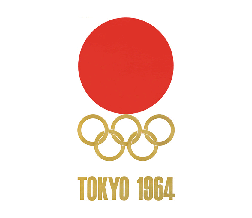
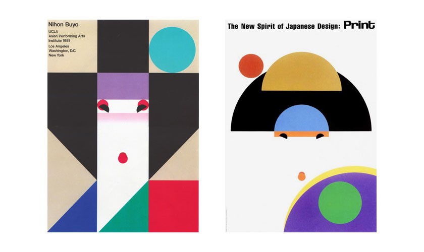
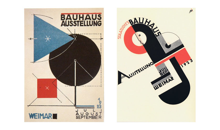
I personally do like the new logo a lot, although it feels like a slightly-retro homage to the 1964 Olympics emblem designed by Yusaku Kamekura. Also Ikko Tanaka‘s graphic design work or systematic Bauhaus design come to mind.
The logo might lack a little in freshness or the sporty spirit of the Olympic games and has quite a corporate feel overall, but it’s a challenging task to create a timeless piece of visual design history. Non-frilly design, the avoidance of contemporary style trends and the reduction to basic geometrical shapes are probably still a good recipe.
The various shapes can be combined to an infinite number of objects, landscapes or patters. It’s easy to see that this Tetris-like design system can give playful flexibility when applying the visual identity design to other branded media such as print, digital applications or online media like the screenshots taken from the official introduction clip below:
![]()
![]()
![]()
![]()
![]()
![]()
![]()
![]()
![]()
The official introduction video clip:
https://www.youtube.com/watch?v=v3s6fxIFTH0
The full length text from the 2020 Olympic emblem official introduction page:
When the world comes together for Tokyo 2020, we will experience the joy of uniting as one team. By accepting everyone in the world as equals, we will learn the full meaning of coming together as one.
The Tokyo 2020 emblems were created to symbolise the power of this unity.
The black colour of the central column represents diversity, the combination of all colours. The shape of the circle represents an inclusive world in which everyone accepts each other. The red of the circle represents the power and strength of every beating heart.
These elements combine to create the emblems of both the Olympic and Paralympic Games.The Tokyo 2020 Olympic emblem is inspired by the T in:
- TOKYO
- TOMORROW
- TEAM
The Tokyo 2020 Paralympic emblem is inspired by = the universal sign of equality.
2020 is almost here.
Let us unite in the spirit of these emblems to stage an Olympic and Paralympic Games for a better world and a brighter future.