Today is the first day of the new year in Japan, notably in my wife’s hometown of Iizuka, an economically-depressed city-suburb of Fukuoka1 in the southern island of Kyushu in Japan. We spent the previous evening tending assorted pagan ceremonies with her family welcoming the new year bonfires around a shrine surrounded by fields, a mountaintop temple where we banged a gong that resounded for miles and in a city center where we honored ancestors and afterward drank sake from cups Jerry-rigged from freshly-cut bamboo. It was a memorable night – the first of many in Kyushu, but moreover, a precursor to the New Year.
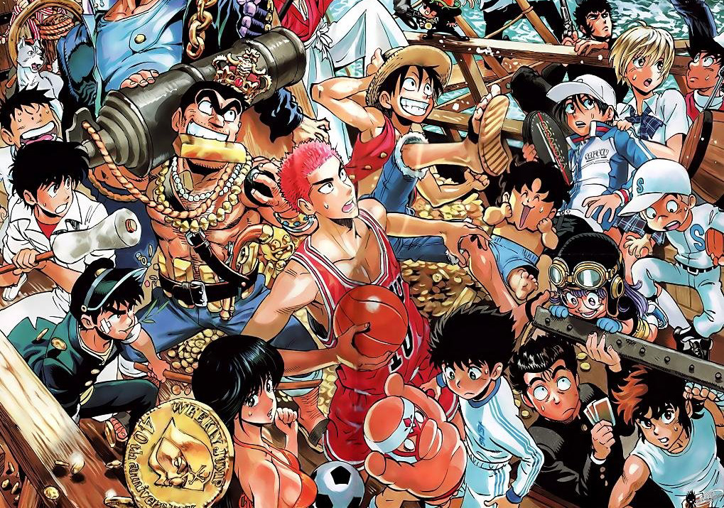
New Years Day found us traveling to and fro, visiting old friends from my wife’s childhood, but no scene was more memorable than a certain young boy reclining on his family’s miniature sofa, a copy of Shonen Jump held aloft firmly in his hands as he reclined, ignoring the infants’ feet stomping about his head as he concentrated on reading. This is Manga – something so deeply entrenched that we as a culture outside of Japan will forever be unable to understand it. Comics are forever engrossing, but to be smacked firmly about the head and pay it no mind is something special a comics more holistic than most Westerners can imagine. I know this firsthand I’ve spent the past few months reading the digital back-catalog of most Marvel titles, thanks to a friend’s continual offering of e-versions. It’s been great fun, if a bit mind-numbing at times, due to the unrelenting, jumbled story-lines and continual death and rebirth that are so much a part of American superhero comics. I loved comics when I was a kid and after a brief break during late adolescence, spent a handful of years creating and publishing indie mini-comics of a woefully poor nature in the mid-90s. I’ve read a fair amount of Manga – from Osamu Tezuka’s classic epic Buddha to a few issues of more populist contemporary fare like Yotsuba To!, One Piece and My Darling Is A Foreigner, with a smattering of alternative Manga such as Garo, Ax and the exciting, futuristic work of Yuichi Yokoyama, as well as a sprinkling of yokai/monster comics and dōjinshi. I’ve read just enough to have a fair understanding of the nuances of the genre, but have never been truly passionate about it. Manga trend toward the over-dramatic, the unspoken and toward a hyper-stylization that can be either stunning or neutralizing in their effects, playing out over so many issues as a title will last (or falling prey to repeat gags, as is the case with later Doraemon comics).
During my time engrossed in graduate studies on Graphic Design, my professors continually asked us to try to explore, enrich and enhance contemporary forms of visual storytelling. To me, comics, and subsets such as Manga, are perhaps the definitive forms of visual storytelling – they show and tell in ways that graphic designers aspire to2, but often cannot penetrate. Manga’s influence on contemporary Graphic Design is more than overt – the 1990s saw The Designers Republic, Buro Destruct and a horde of others use simplified Manga caricatures in vector and 3D formats, accompanied by kana and kanji give the dual appearance of futurism and a faux hyper-globalist sheen. This continues today with the rapid assimilation of Japanese visual elements into the work of assorted designers around the world today.
Most often, graphic designers utilize Manga’s aesthetics via a mere surface skim process, picking up stylistic elements that hold visual appeal while not comprehending the depth and breadth that Manga as a platform holds. Having grown from fairly rudimentary boy/girl target market origins, Manga are now created for nearly every social subculture and slice of society in Japan – they are gender-oriented, age-oriented, sexual orientation-oriented and socio-economically-oriented across nearly every market segmentation that can be surmised. An example: Hot Road was a vengeful, ultra-violent series of comics published in the 1980s that targeted junior high school and high school girls, notably those belonging to the blue collar/conservative Yankee subculture. Each month sees a growing array of titles that have both as wide and as culturally laser-focused an appeal as possible.
Japanese contemporary artists picked up on Manga’s cues well ahead of the curve – Takashi Murakami’s over-the-top, hyper-sexualized use of Manga and anime has launched him into art stardom while simultaneously making him despised in certain critical circles due to his glorification of otaku aesthetics. His Superflat touring exhibition, essentially a P.R. juggernaut for his KaiKaiKiKi jimusho3-managed (Aya Takano, Mister, et al) and associated artists (Yoshitomo Nara, Groovisions), brought “Cool Japan” to Los Angeles, Minnesota and the Pacific Northwest well ahead of design contemporaries abroad. Aida Makoto has repeatedly incorporated Manga-style renderings4, Eye Yamantaka’s work revolves around a triaxial conflation of punk aesthetics, collage and crude abstracted manga caricature, and Kinya Hanada a.k.a. Mumbleboy and Katsura Moshino’s use of vector-drawn characters in their assorted animation, sculpture and installation work – each was a harbinger of aesthetics that came, and found niche popularity internationally in mass-produced album covers for a bevy of independent musicians in the late 1990s and nascent 2000s.
Graphic designers-cum-fine artists Groovisions picked up on the salability of Manga with their armada of androgynous Chappy illustrations for innumerable clients from the 90s through today, as well as the self-initiated sculptures and music project of 1996 that spun out of the well-received series. Through sheer association, their Brockmann figures created perhaps the most overt bridge between Manga and Graphic Design – the name an homage to the godfather of the International Style of Typography. Edited into a fine-tuned monograph, their GRV2000 serves as a timely epitaph to the 90s obsession with both clean vectors and the resurgence of the Swiss school, all further entreaties into said style feeling derivative – Groovisions, Rinzen and similar design teams having inflected the Swiss school5 with illustration derived from a Manga-centric starting point and battered away at the subject until no interest was left.
Despite innumerable entry points, unknown to most is the common ancestry that Graphic Design and Manga share in Japan – each developed their own individual visual languages and structures in the early 20th Century, absorbing preceding Western counterparts. For Manga, a rich history of painting, printmaking, caricature and cartoons helped inform the Japanese sense of what exactly a comic book is. Graphic Design, first defined as such by the American designer William Addison Dwiggins in 1922, absorbed similar historical practices, bringing aspects of illustration, “pasteup”, lettering, typography, image-making and general commercial art into a generalized but respected field of creative labor.
In Manga, there is a high emphasis in multi-layered texts and juxtaposed figurative images, as well as poignant use of color and texture for cover designs. Alternately, some titles are more simplified in tone and composition, notably Kiyohika Azuma’s cover designs for the wildly popular contemporary Manga Yosuba To!. As noted in the introduction to Manga, Anime & Light Novels, “For some, they could be regarded as “bad” examples of the ‘standards’ of Modern Graphic Design, which has set a high value on rationality and functionalism. At the same time, these designs push expressionistic modes of communication and are fraught with complexity and contradiction – pinnacles of signature work which capture the ethos of the ‘designer as author’6“. It is this level of both abstraction and pluralism which helps connect readers to individual works in this varied field, instigating an emotional connection both through visual narrative storytelling and each title’s component parts.
It was during this period of the 1920s and 1930s that “commercial art” and “advertising art”, the preceding nomenclature for Graphic Design, would first bloom en masse. This expansion and recognition of the field would be mirrored in the formalization of visual narrative structures in Manga – comic panels and speech balloons becoming codified as the palette within which generations of “Manga-ka” (Manga artists) would bring forth universe after universe of personal vision in comic form. Both fields were informed by the perspectives and storytelling tropes of photography and cinematography, as much as fine literature. These outside perspectives helped to inform how Graphic Design and Manga would interpret space, time and narrative on micro- and macro-levels.
In pre-war Japan, Manga was perceived as a hot new medium and a host of books advertising the methodologies and means of sequential narrative came into being. At the same time, a wide array of Graphic Design idioms came into play both from Japan and sources abroad from the Meiji Era onward. There is no easy overarching set of visual guidelines which can be easily applied to define “Modern” Japanese Graphic Design7, other than the technology in play used for reprographic purposes (limited color palettes, rough resolution photographic reproduction, cold and hot metal typography) and the sensibilities of myriad practitioners sharing common aesthetic and cultural influences. Other critics have argued that an application of visual elements co-opted from progressive aesthetics from foreign cultures, including but not limited to Art Deco and Avant Garde movements defines Japanese Modern Graphic Design. While there is no argument that forms of visual expression from abroad were highly influential – (It is no coincidence that Marinetti’s 1909 Futurist Manifesto was translated into Japanese the same year it was published.) little allowance is made for the horde of other influencing factors – particularly the influence of vernacular advertising from both the West and the East whose elements and influence were also assimilated.8
Post-war, both the Japanese disciplines of Manga and Graphic Design enjoyed a period of rapid growth and stylistic development fostered by high economic growth from the 1960s through the 1980s. Manga, in particular, developed a unique language of storytelling apart from Western tropes of caricature and comics – a synthesis of both East and West, but singularly Japanese in perspective, methodology and narrative means. For example, Japanese visual expression of physical speed is rendered in comic form utilizing radial or character-traversing ‘speed lines’ as opposed to visual ‘trails’ as in typical American and European comics.9 The same can be said of general drawing style, as well – in Manga legend Osamu Tezuka’s body of work, characters were often drawn in as many as five or six different visual vernaculars – a mash-up of reference to French caricature, Disney doe-eyed-ness, goofy brutes and refined homespun Manga form. American comics during the waning years of the Golden Age of Comics (1938–1956) and Silver Age of Comics (1956–1970) almost always tended to be drawn with stylistic uniformity, each character rendered in the same vein and aimed at creating a more ‘seamless’ experience for readers. Tezuka and a large number of Japanese Manga artists set out to create works that were decisively more exploratory in style, as well as in narrative – their works tended to consistently “break the fourth wall” and directly address readers, whereas American and European comics rarely did the same aside from advertising for snack cakes and other products within comic titles.10
Historically, Manga were produced apart from the mainstream design industry – having been designed mainly by editors or printers11 and comprised primarily of simple combination of pictures and titles supplied by individual manga artists, while mastheads and story titles were often drawn by lettering artists. By evolving, in essence, outside of increasingly codified notions of ‘good’ design, more risks were taken in how editorial teams presented their work to their audience. Elements of Graphic Design were incorporated, but infused with a sense of exaggeration and personality that was increasingly discouraged during the evolution of Modern Graphic Design. While the design industry turned to Helvetica and a sophisticated, yet wholly sober sense of neutrality in how it conveyed itself, the Manga industry turned instead to new forms of expression, enriching its identity and output with experimental form and narrative structures. This cult of personality increasingly multiplied as television diffused popular culture in Japan. Anime became an instant hit among children and adults, giving birth to a huge character business market – initially simplistic and primitive in appearance, character-based design industries now permeate greater Asia in the contemporary context.
From the late 90s onward, the design of Manga publications and Anime packaging became intensely more sophisticated and began including designer credits – a first for a market well-known for downplaying individuals’ contributions aside from authors and editors in Manga’s nascent stages of development12. The Manga industry’s markets had reached a mature stage in economic growth: it was comprised of a diverse segmented audience and increasingly enormous production labor was involved. A singular title had to present a particular “flavor” or acceptable code of communication, but still had to differentiate itself from other titles. Manga titles had to look similar, but unique, and the steady hand of the accomplished designer was often brought in to help identify ways and means in which a title could identify itself while remaining appealing. With the boom in the character business and associated cross-media merchandising having become common, design policies and visual identity programs were established to help reify Manga, Anime and character – based brands’ standards of both identities and boundaries.
The introduction of computers in the design and printing industries was another major reason for the citation of individuals’ unique contribution to creative publishing. The Desktop Publishing Boom allowed super-efficient production of publications for the first time, streamlining the process from one that is wholly analog to one that is primarily digital (at least in terms of files being submitted to printers). Many young designers grew up with Manga, Anime and associated character cultures as the backdrop to their childhoods and it makes sense that hybrid positions would develop which straddle what were formerly separate fields of creative commercial activity.
Manga and Graphic Design both incorporate elements from highbrow and lowbrow culture, in particular since the mid-1980s. This collection of character-based publication designs is focused on the work created after this time – an era when Manga for young adults became readily available in A5 size due to the collaboration of the Manga industry with designers outside. It was a time of great experimentation in both Manga-related fields and Graphic Design. This is shown in the myriad ways in which books and media packaging have come to synthesize unique formats and means of communication, both on the surface and in the narratives themselves. A general knowledge of the development of Manga formats is essential to help understand why and how Manga developed as printing technologies became more accessible and, more importantly, more affordable.
Recent academic studies on Manga have investigated the underlying media and technology that facilitate production, in lieu of merely focusing on the cult-like fan-bases surrounding individual authors and works. It can be supposed that the historically recent design-oriented phenomenon in Manga (and associated character-based industries) are obvious signs of their decline, as this fascination with surface aspects of gloss and sheen is a result of marketing and a preoccupation with sales figures. After a healthy period of growth and development, the “selling out” of a culture is often figured into the life cycle of market-based creative industries. However, it is worth noting that Manga primarily developed as a culture and an industry outside of typical artistic production, and due to this, contains elements of fanaticism and mystery that will assuredly drive the industry further.
Any day of the week will find Japan’s bookstores’ Manga sections crowded with readers perusing titles and buying stacks of publications unrivaled in the West. It is this love for an indigenous means of communication that props up the industry, and it is a love that I very much doubt will end. Manga open further possibilities and richness to Graphic Design as a medium. Conventional Graphic Design can learn a lot from these eclectic Japanese visual projects – how to transcend globalization through a truly nuanced visual language and the ‘flattening’ of design styles, how to inform design work with personality and how to continually engage with our collective chosen profession.
- and hometown of former prime minister Taro “Foot In Mouth” Aso.
- and more often than not, just trot out as lip service. Why is graphic design so obsessed with this concept of telling stories? In much the same way that designers feel a sense of ineffectualness when stacked up against fine artists, they apparently feel the same way when stacked up against authors. I wish I knew what the hell was wrong with just being a damn designer.
- What’s a jimusho? In short, it’s a production company in Japan. Suggested reading: W. David Marx’s excellent series of essays charting the history and contemporary form of the jimusho: http://neojaponisme.com/2010/04/05/the-jimusho-system-part-one/
- and saw his artwork repeatedly pillaged by over-hyped and now deceased Tokyo art director Noda Nagi.
- It is here that I question Experimental Jetset’s ideas of a myriad of dialects of the International Style as a ‘linguistic diaspora’ as espoused in the pages of Print Magazine’s October 2011 issue. Style is style, not a language, despite their ability to expound upon this concept with an expanded vocabulary and pre-post-modern rhetoric. It’s a cute idea, but crumbles fairly instantly. The argument is akin to a music critic saying that Auto-Tune is a language. It is not. (Nate Dogg is a language. Not really – he was just a fellow who could sing and hit all the notes that T-Pain can’t.) To try to extrapolate style into a full-blown linguistic system is just silly, hence the inability of critics to pigeonhole Postmodernism by attempting to exorcise it by calling it a style and a style alone. We are still well in the throes of it, and the reactionary, backward/forward aesthetics of neo/retro Moderns and their imitators are monument and testament to this. More academically-oriented Graphic Design’s recent obsession with rehashing “desktop publishing” aesthetics is further evidence of this cycle.
- Michael Rock, The Designer As Author http://eyemagazine.com/feature.php?id=30&fid=258
- Lynam, Ian; Japanese Modernism Reconsidered; Slanted #12
- In American comics’ defense, the Silver Age of Comics brought about an interest in ethnically diverse characters riddled with imperfection and self-doubt and explored social issues, for example, Iron Man’s alter ego Tony Stark’s alcoholism. However, this was often coupled with ham-fisted portrayals of all of the above (racial stereotypes, simplistic approaches to social injustice and ills and over-emotive caricatures).
- Moreover, Japanese Modernity was just as much a self-initiated endeavor, not mere contextualization of foreign influence: this is a simplistic (not simple or simplified) misconception that has dogged the perception of Japan internationally for centuries. To pigeonhole “Japanese Modern” as merely design in Japan that aped the visual styles of Avant Garde movements abroad is both a disservice and a misstatement popularly reified both domestically and elsewhere. The Modern age in Japan started well before overt Western elements began appearing in posters, matchbox covers, book covers and signage country-wide in the 1920s. A movement toward posters and printed materials with reductive compositions with pointed, streamlined deployment of imagery and typography/lettering was well under way two decades prior.
- I wholeheartedly recommend checking out all of Scott McClouds books on comics and sequential narrative for a more detailed dissection of how Manga and Western comics are differentiated. At the absolute least, check out his breakout debut Understanding Comics.
- In much the same way that a lot of early design and typography was done by editors and printers.
- This development is in lock-step with the further rise in popularity of lone-subject titles against the traditional compilation format on sale at train station newsstands across Japan.
A large thanks goes to Kiyonori Muroga- a large part of this essay was initially investigated in our introduction to the book Manga, Anime & Light Novels published by Seibundo Shinkosha in 2011.