Japanese Graphic Design: Not in Production focuses on the activities of highly active designers, type foundries, distributors/retail spaces and Japanese design publications from the past ten years. The goal of this section is to help promote cognizance of graphic design activity in Japan — acknowledgement of such activity is often hindered by the linguistic and social differences between Japan and the rest of the world, yet this gap is lessening.
Booklet Press
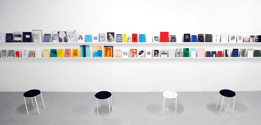
A non-profit, small-scale press and independent publishing library located in Minato-ku’s Shibaura House. Run by architects Morishita Yu and Évita Yumul, Booklet is a free library devoted to small press initiatives, focused primarily on ‘zines and cultural publications.
More:
http://bookletpress.org
Okano Kunihiko
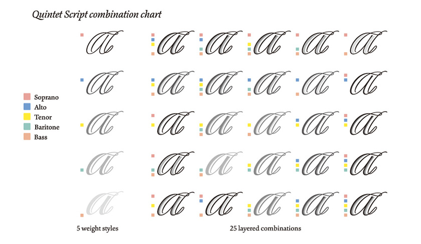
A recent graduate of the TypeMedia program at the KABK in the Netherlands, Okano stands as perhaps the most nuanced and rigorous designer of Latin typefaces and lettering in Japan. His most recent typeface is Quintet, a layered script family available via House Industries’ PLINC system. Quintet demonstrates his years of experience studying the nuances of calligraphic lettering.
Kunihiko Okano’s approach represents a calligraphic-based approach that emphasizes legibility and readability in creating Latin character sets that complement the Japanese character sets for the typefaces he designs. A tireless and thorough craftsman, Okano is an unrelenting force in the Japanese sphere of typography. His work speaks for itself — graceful and poised type designs that retains the springy qualities of pen-rendering.
The AXIS Font family, much of which is the work of Okano, is the typeface family utilized by Apple, Nintendo, and Mazda to express the brands’ typographic voices in Japan. NTT Docomo, the largest mobile phone carrier in Japan, also utilizes AXIS as the default typeface for its handsets. Despite the contemporary styling of the AXIS Compact family, whose Latin forms follow the formal evolution of humanist sans serif typefaces such as Frutiger and Myriad, Okano is no mere default Modernist. His work exercises multiple perspectives — the chopped terminals of punch cutters, deep ink traps of the 1970s and 1980s, and exaggeratedly differentiated counter spaces enhance readability with one foot in the past and one solidly in the present. Okano’s typefaces move your eyes — some almost somnambulantly in their refinement, while others insinuate a rhumba, moving optics along in steady, surprising succession.
Okano’s logotype work operates in different terrain, often that of contemporary nostalgia — a national obsession with better days (given form via the 1995 movie Always — San-chôme no Yûhi, a gauzy, soft focus look at the post-War obsession with the automobile and the electric conveniences freshly offered to the general public at that time). While in no way overt, many of Okano’s works mine history for aspects of their base forms, then update them with the sharp angularity offered by an incisive sense of the contemporary. Okano is no retro revivalist offering up readymade solutions; his work is that of one who understands history, then synthesizes and sublimates the lessons of the masters into brave new form.
More:
http://shotype.com
so+ba
This design studio in the Kyodo area of West Tokyo was established in 2001 by Swiss partners Susanna Baer and Alex Sonderegger. so+ba is active in the fields of graphic design, art direction, and sound visualization. Both partners teach typography and design at Tama Art University.
More:
http://so-ba.cc
Dainippon Type Organization
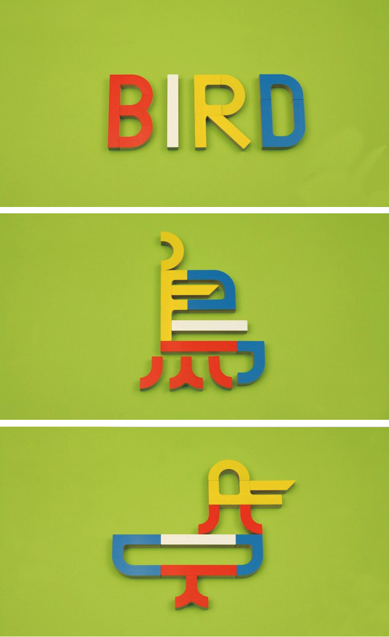
Partners Tsukada Hidechika and Tsukada Tetsuya operate a hybrid typographic design practice and product design studio devoted to typographically-themed toys. Their “Toypography” project is a system of colorful, modular curved, and straight shapes for creating Latin and Japanese characters. Their playful take on connotative bilingual lettering treatments for corporate and commercial clients is both evocative and masterful, despite veering wildly from style to style.
More:
http://dainippon.type.org
Yorifuji Bunpei
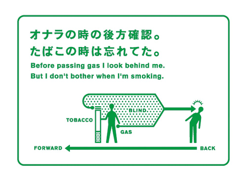
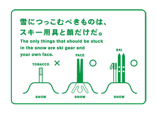
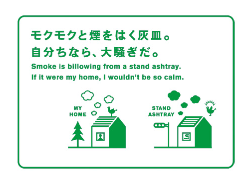
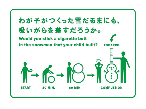
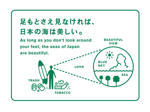
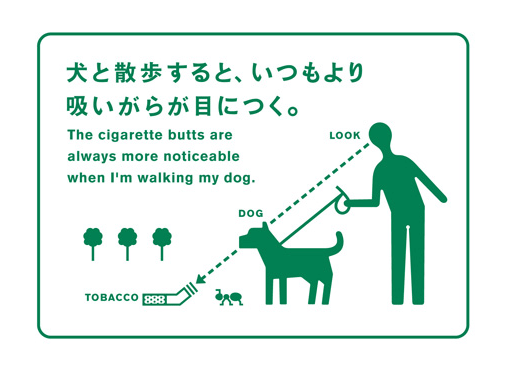
Mixing twee, oddball illustration, accomplished typography and pop color schemes, Yorifuji Bunpei’s work is omnipresent throughout Tokyo. Yorifuji-designed posters for the Tokyo Metro train system adorn every station and his public awareness campaigns for Japan Tobacco dot the streets of the city, reminding citizens of the potential good manners of smoking. His large-scale worked is backed up by the design of innumerable intimate art and photography monographs for small publishers like Nanarokusha (ナナロク社), Akagokusha (赤々舎).
Yorifuji has simultaneously produced multiple self-initiated projects. The yPad is a series of iPad-sized sketchbooks filled with grids, typographic tips, and project scheduling calendars intended to help designers. His bestselling self-published books The Catalogue of Death, Master of Imagination & Drawing and The Catalogue of Unco mix quirky illustration, oddball humor, and prose with appealing, well-considered typography and design.
More:
http://www.bunpei.com