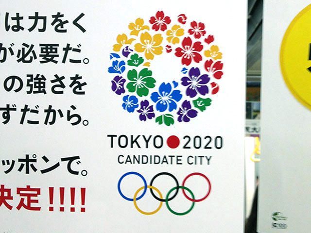
Train ads and posters are popping up in Tokyo advertising the city’s aspiration to host the 2020 Olympic Games*. Adorning the posters is one of the most unimaginative logo designs of recent years, and as expected, a retrograde return to the expected visual formula for Olympics after the hard left turn that was the branding of the London 2012 Olympics.
The website promoting Tokyo’s candidacy as the 2020 Olympic city1 says this about the proposed logo:
The logo comprises an arrangement of cherry blossoms, Japan’s most celebrated flower, and supports the efforts of Tokyo as its bid to host the 2020 Olympic and Paralympic Games. The logo has been designed to symbolise the concepts of friendship and peace, and the floral motif expresses the feelings of deep gratitude inherent in Japan’s sending of cherry blossom trees to all parts of the world.
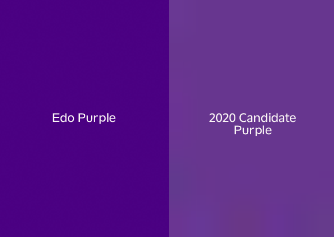
In addition to the Olympic colours of red, blue, yellow and green, the design incorporates the traditional Japanese Edo purple, a colour that featured prominently in cultural festivals, events, etc. in Japan’s Edo period (1603-1867). Each individual petal and the circular wreath shape of cherry blossoms represent the interconnectivity and interdependence of the world.
As the wreath has no beginning and no end, the logo also signifies the concepts of eternity, happiness and a continuous unbroken cycle. The design also embodies the strength of feeling that underpins Tokyo’s bid to bring the Olympic and Paralympic Games back to Japan for the first time since 1964, and the firm conviction that the Games will serve as a catalyst for the reinvigoration and regeneration of the whole of Japan.
The logo was designed by Ai Shimamine, a Japanese student in a competition to submit logo designs for the bid. Her winning entry was selected by a panel of judges comprising Tokyo 2020 CEO Masato Mizuno, award-winning designer Kashiwa Sato, and leading script writer Kundo Koyama.
While the branding is described as such on the website, how it is being used in public has a bit of a twist — the posters and train ads (one pictured below) include the five Olympic rings as well. In essence, the logo, an obvious conflation of the Olympic rings and the hinomaru2 with a decorative treatment of randomly colored sakura vector illustrations, needed the visual components spelled out for the public, as the mark itself isn’t a stable enough signifier on its own.

Being a product of student design work3, it’s worth critiquing this logo as being exemplary of the type of lazy graphic design education standards that are currently upheld in much of Japan’s design university curricula.
1. Lazy type
The logo uses DIN, one of the world’s most non-offensive typefaces, then mimics the type treatment of Kamekura Yusaku’s 1964 Olympic logo placement of the hinomaru between the “Tokyo” and the year. To some, it’s perhaps a nod to history, though I’d reckon it’s just an easy, unimaginative swipe.
2. Hamburger Hot Dog
The conflation of sakura cherry blossoms (sure, sakura are fine when they are in bloom and are a widely acknowledged symbol of Japan) and the color treatment of Olympic colors along with the distinctly non-Edo era-evocative purple are exemplary of weak conceptual thinking and the most obvious “visual solution” applied, then bolstered by the application of another weak “concept.”

I refer to this type of design as a “hamburger hot dog” — two distinctly obvious choices forced together (or, more colloquially, the inverse of peanut butter and chocolate: two great tastes that absolutely don’t go together). I get hit with this kind of thing weekly on the critique wall in my graphic design classes at Temple University Japan and insist that my students start over each time. The Modern age of “The Big Idea” in graphic design is over, but moreover, when you take what someone purports to be a Big Idea, but is actually a fairly Small Idea, and then apply an even Smaller Idea to attempt to reify your attempt at a Big Idea, and all you wind up with is visual and conceptual mud.
3. Pizza Pizza Pizza
The rings plus the circle plus the wreath is the visual equivalent of saying the same thing three times in a row.
4. Cabbage Topping
Somehow a little cabbage got tucked into the top of the logo, as well. (I understand that it’s supposed to be a sakura bud, but it just looks like a cabbage, or at the very best, a brussel sprout.)
5. Spec Work
I hate design competitions, and moreover, I hate student design competitions. Sure, it may help that student get a job after school, but design competitions are a form of speculative labor. We don’t participate in design competitions with my design studio4, and I actively encourage my students to not participate in design competitions, as well. School should be a time for exploration and experimenting in the laboratory, not aping market rules, visual trends, and reductive thinking. Why can’t the Tokyo Olympic committee afford to pay someone for something that is going to make them a lot of money whether Tokyo wins the bid or not?
6. Y-A-W-N
As inflammatory as it is, Wolff Olins’ design for the London 2012 Olympics constituted an about-face on the typical “easy on the eyes” variety of graphic design and branding schlock that has been continually foisted upon the Olympic games. The London branding was divisive and engaging, and in that way, embodies so much of what the Olympics are about: They are a series of true competitions, not mere visual coddling and cheap ethnic variations of the same theme. I am a fan of design that challenges — and London’s branding did. The proposed Tokyo Olympic branding most certainly does not. It has neither the visual complexity nor conceptual depth/ambiguity to sustain multiple viewings.
Summary:
All in all, there’s just not a whole lot to grab on to visually or semiotically5. The 2020 Candidate City logo is all surface, but one that isn’t slick enough to sustain. It feels like repetitive clip art and weak themes (not concepts6) taken to their too-logical conclusion.
Craft-wise, the symbol feels amateurishly executed and displays a frightening lack of adeptness at the contemporary tools of design (notably the designer’s inability to correctly draw vectors in Illustrator — if design educators cannot teach students how to handle design-oriented thinking, they should at the very least be able to impart craft and correct practices in designing).
Most of all, I worry that I’m going to have to be stuck looking at this thing over and over again for the next eight years7. Train rides are mundane enough, but even a bit of recurring engaging graphic design makes each ride just that much better.
- Page no longer online. See the official Tokyo Olympics Site here: http://tokyo2020.jp/en/
- Also known as a circle.
- Shimamine is a student at Joshibi.
- I was approached regarding a speculative project this week for a non-profit, who insisted that it was 100% acceptable to, in essence, donate a day of my time to provide them with a free stab at their home page redesign. My response paraphrased:
“I’m sorry, but we cannot work for free. I have to set precedents, hence our not-working-with-Third-World-contractors policy and our not-doing-spec-work policy. Absolutely nothing good comes out of these situations — you’ll get a rushed design (which still takes hours of labor on our end) and we start our professional relationship in a non-professional manner which will have repercussions later.
We staunchly refuse to work spec because it means that:
A. The (not-quite-a-)client doesn’t understand that design is more than cultural hairdressing.
B. It sets a precedent for an unprofessional financial relationship. I don’t ask my clients for handouts, why is it acceptable the other way ’round?
C. There are no guarantees. I bet that if we agreed and did it, your company wouldn’t match our proposed budget after we provided the first round for free.
To be frank, if you proceed with a design/development studio that agrees to spec work, I bet you’re going to be disappointed in the future. Professionals act professionally and those that take on spec labor are usually the least professional in terms of output.” - The logo is not a visual metaphor, metonym, simile or anything truly thoughtful. In the end, it’s a ring of flowers that apes the look of the Unilever logo and other contemporary modular logos without the thought involved.
- One of the most angering things about graphic design education in Japan is the confusion of themes, style and concept — one is not the other; however educators rarely, if ever, take the time to explain this in either the historical context or the contemporary one. Concepts can be executed stylishly, a la Robert Brownjohn and Barney Bubbles, however most design faculty in Japan tend to gloss over the finer points of conceptual thinking in an applied setting. Mere surface style is served up as a substitute for a balance of form and concept in most Japanese design university classroom settings. Even worse, style is discussed inadequately, leading to the current generation of Japanese graphic designers being unable to either make holistic work, much less talk about it. (The point: Graphic design education in Japan stinks and needs a real boot to the tuckus.)
- An analogue can be found in issue #19 of Slanted Magazine within the section titled “Japanese Graphic Design: Not In Production” in which I wrote about Zombie Modernism 2.0 and my desire for ambiguity and contradiction in graphic design, not simplistic formula-based design.
- Disclaimer: This article was written before Tokyo won the 2020 Olympics candidacy.
