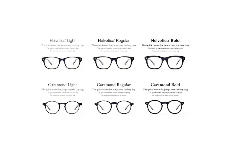
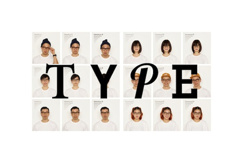
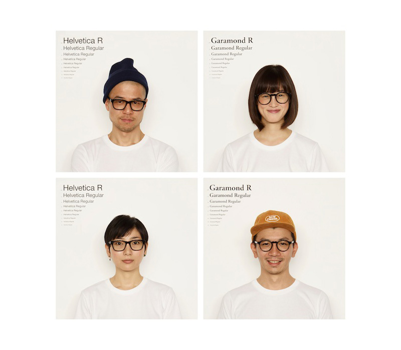
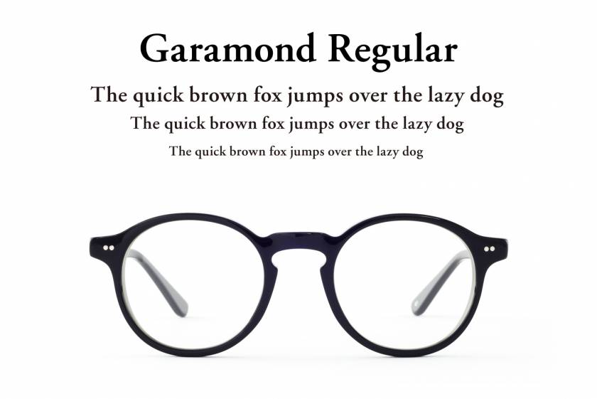
New Japanese eyewear brand Type is turning two of the most famous fonts in history into spectacle frames: Helvetica and Garamond. Type is a collaboration effort of Oh My Glasses with Tokyo based advertising agency Weiden + Kennedy.
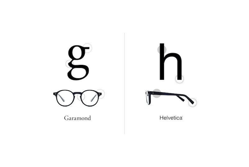
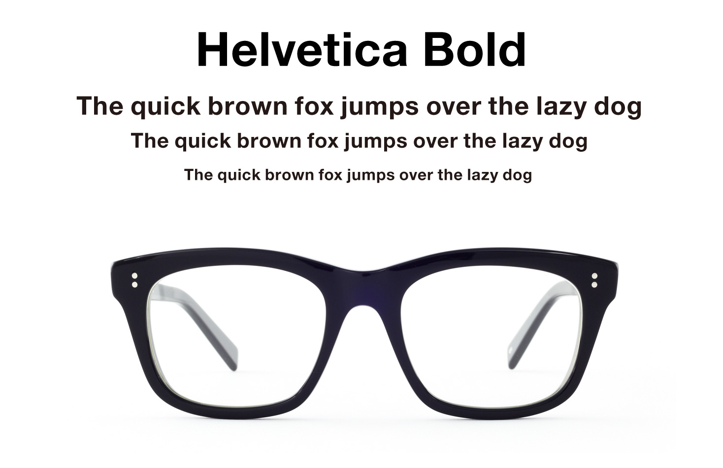
Interestingly the frames take cues from the actual shapes of the fonts and come in two weights (regular & bold) and variety of colours and lenses. It will be interesting to see if other fonts will be added to the line-up. Let`s hope it won`t be Comic Sans. If I had to pick one font – which is dearest to the Japanese designers for quite a while already – it would have to be FF DIN (you can discover this font, or derivatives everywhere in Japanese advertising).
The new brand comes with this luscious – all caps – claim:
YOU ARE A CHARACTER.
YOU HAVE A VOICE AND A STYLE.
YOU’RE STRAIGHT. OR YOU’RE ODD.
YOU’RE CLASSIC OR COMPLICATED OR LIGHT OR CLUNKY OR SIMPLE
AND YOU ARE WHAT YOU ARE AND THAT’S GOOD
BECAUSE THAT MAKES YOUR TYPE THE TYPE WE LIKE.
I have the suspicion this brand will sell well with the general hipster type (no pun intended) and requires facial hair and a skateboard to round off the appearance (Or: how about a Helvetica T-shirt?).
Personally I am still waiting for italics.
p.s. I haven`t cracked this one: The Type tumbler account features similar Japanese storefront lettering samples as found on the Noramoji site. If anyone has ideas let me know in the comments.