Today we will look at the user interface design of food ordering systems.
The first example we have here is from Genki Sushi, a sushi chain that I can hearthily recommend. If you’re visiting Tokyo there is a Genki Sushi near Shibuya station.
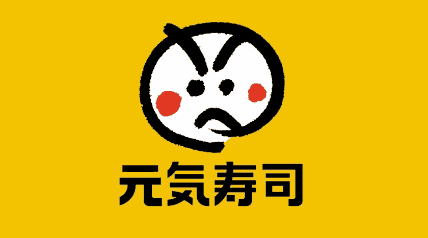
Genki (元気) means healthy or lively in Japanese.
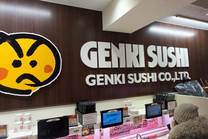
I don’t really understand why they chose an angry face for their logo. Then again, there are many things I don’t understand about Japan yet.
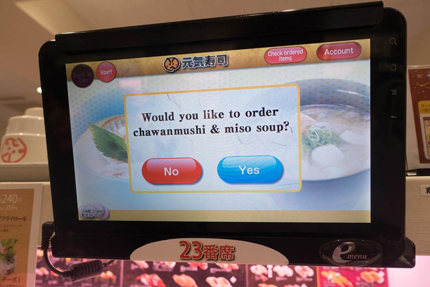
When you enter, you are asked if you want to order chawanmushi or miso soup. A traditional Japanese meal often begins with some miso soup.
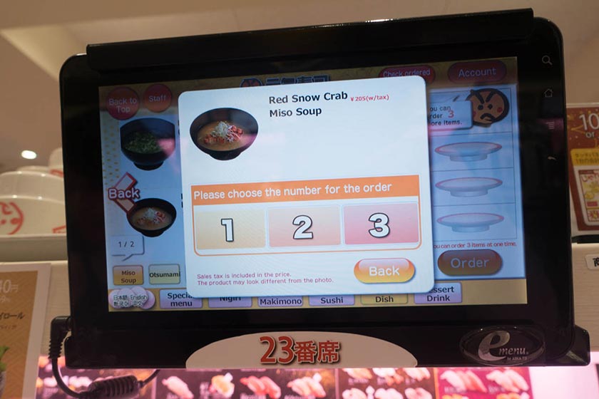
This screen says “Please choose the number for the order”. It should probably have said “How many would you like?”. This is a typical “bad” Japanese translation. Japanese doesn’t really map to English very well. The Japanese language omits pronouns, and often meaning has to be derived from the context.
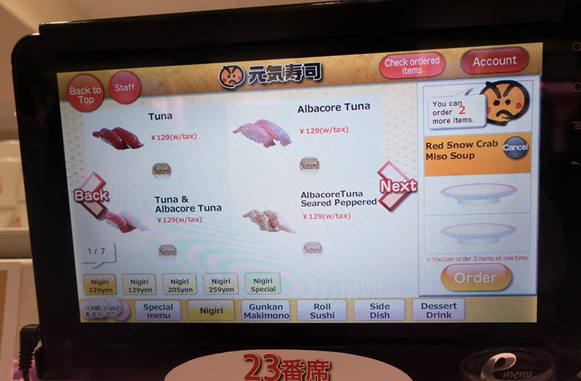
The UI for browsing the various sushi looks like this.
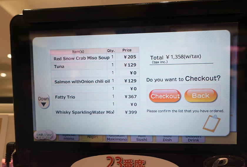
When you’re done eating, the checkout screen looks like this.
After you ordered there is a random chance you can play rock-paper-scissors against the computer. If you win you get a discount coupon or a sushi themed keychain.
As I learned, rock paper scissors is a good way to solve conflicts Japanese-style. In Japan, this game is called “jan-ken-pon”. It is an important part of Japanese culture.
That’s it for today!